I believe everyone knows the importance of a logo to a company. It plays a pivotal role in both visual brand communication and conveying the company’s internal and external spiritual and cultural concepts. So, what makes a good logo? Today, I will briefly talk about the standards that a good logo design should have.
1) The design must be relevant
The designed logo should fit the client's business characteristics. If the logo is designed for a lawyer, then any elements that are not strict should be discarded. If the logo is designed for a video website, it should reflect the characteristics of the video; the designed logo should be consistent with the client. It is related to the profession and the group it is oriented to. To understand these aspects, it takes time and in-depth investigation. If you don’t have a comprehensive understanding of the customer’s situation, how can you make your logo meet the customer’s needs while being different from the customer’s competitors?


2) Consecutive Design Genes
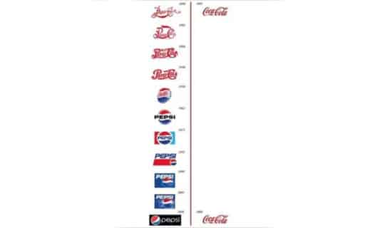
Trends belong in the fashion industry, not in logo design. Trends are like the wind, they change, and you spend so much time and energy, you don’t want the design to expire overnight. For a logo, the service life is very important. As long as the business of the company continues, how long it will have a life. Of course, after using it for a period of time, it can be slightly modified to add freshness, but the concept of its connotation cannot be changed.
3) Design a center point
Those logos that can stand out in many designs each have a special feature. Find a central point to deepen the customer's image. Customers will not spend too much time discussing a logo, generally just a glance at the feeling.

4) Commonality
A common logo can stand out among many competitors, it has a common style, and can accurately depict the customer's business panorama. But how do you create a one-of-a-kind logo? The best way to start is to focus on designing an easily recognizable logo that can be differentiated just by looking at it and looking at it. Right and wrong alone can create a common identity, and when it comes to design, color is of course important, but shape is the top priority.

5) Photographic memory
A good logo design can make people memorable, even for a brief moment, such as sitting on the subway or bus watching a passing billboard, or maybe walking on the road with an advertisement. In many cases, it's just a matter of lingering on your logo for a short time. You can close your eyes and imagine some logos that deepen your image, which might help.

6) Simplicity is beauty
When designing a widely used logo, simplicity is the key. The ideal situation is that the logo can be down to an inch size without losing detail. To achieve this effect, the only way is to adhere to the refined style, and the refined design can last for a long time.

7) Lasting vitality
A good logo design should have lasting vitality. Therefore, your LOGO design should adhere to the four most basic designs:
(1) Text: just build with alphabetic text
(2) Logo: The text and name are integrated into the entire badge and LOGO design
(3) Image: no text, use pictures to represent the brand
(4) Icon/name combination: one icon, one text name
8) Color
Every logo should be able to exist in full color, white or black, if it doesn't, it doesn't count


9) Flexible
Once the LOGO is designed, it will appear on different websites, leaflets, and posters when it is promoted. What is its location and look and feel?
(1) It needs to be a vector (you need to make it suitable for large size and high resolution occasions)
(2) Its outer contour needs to be close to a square or a circle. For applications, the icon is mandatory to be rounded and rectangular. If the proportion of your logo is not too strange, it can usually be easily adapted to the APP and various social media occasions.
(3) It needs to contain alternative formats. In order to adapt to different occasions, it needs to be able to match with white background and black background, and can exist in the form of single LOGO, LOGO + text, and single text.
(4) It should be readable in different contexts.
(5) It should be readable at small sizes and not feel out of proportion when scaled.
(6) Its design should be decent, and the words in it should not cause ambiguity.
It should have qualities that can settle or develop over time.


10) Brand and Story
A good logo design can let users better understand the brand, can present the company's story from a certain angle, and let users understand how they got to where they are today. It also reflects the history and charm of the brand.


