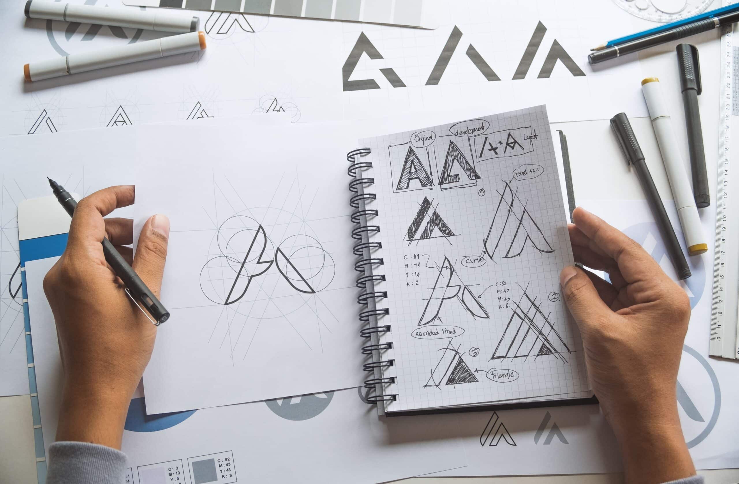
Picture albums generally use paper materials as carriers and use culture and products as communication content. They are a direct and effective form of publicity. So how to design a beautiful and practical picture album?Let's talk about fonts, typography, color matching, white space, background color, and the combination of text and pictures.
1. Font
Several fonts that stand up to scrutiny are:
1. Song style (Biao Song, Shu Song, Da Song, Zhong Song, Imitation Song, Fine Imitation Song) The development of Song Dynasty has gone through several dynasties. Song Dynasty is impeccable, dignified and beautiful, with elegant temperament, combination of rigidity and softness, exquisite and delicate, and beautiful. Black body is a modern font, which is firm and stable, has a sense of strength, and is eye-catching and beautiful. The isometric body is exquisite and attractive, and it feels petty, low-key and not vulgar, and it is a fact of its own.
2. Black body (medium black, flat black, fine black, big black)
3. Regular script (Zhong Kai, Da Kai, Special Kai) It is an extremely classic font. After more than a thousand years of baptism of Chinese civilization and the tempering of countless calligraphy masters, it has become very mature, and every character can stand up to scrutiny. The cultural temperament is very strong. It is used in a full-flavoured picture book.
4. Isoline (medium line, thin isoline)
5. Round black body (medium round, thin round, extra round)
6. Of course, there are also some good fonts that are not included in the list, such as Fangzheng Fanxiu and Handing's Fanhei. In addition, we also need to avoid using some fonts, such as the strange fonts in Wending's new font file, which are vulgar and low-level; in the end, we should avoid computer fonts such as Variety Style, Zhongxingshu, Lishu, etc., which are rough and ugly, and have a temperament. very poor.

2. Typesetting
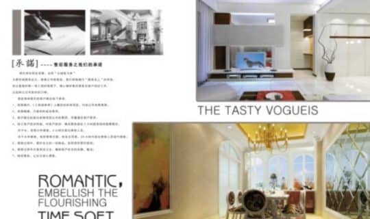
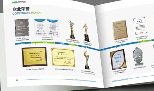
In the album design, the layout design is very important. Only when the typesetting is excellent, will a high-quality album be printed. But the difficulty of album layout is that we do not fill the content (set of templates) according to the already designed layout, but lay out the layout according to the specific content. When the number of pictures in the layout is different, the composition of the layout will be Different. Generally speaking, the basic types of album layouts are:Grid type, full type, free type, up and down split type, left and right split type, central axis type, inclined type, triangle type, curve type, etc.. Each type has its own advantages and characteristics,
3. Color matching
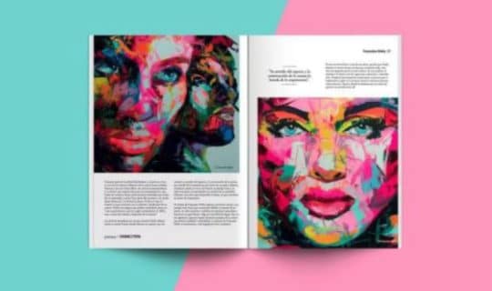
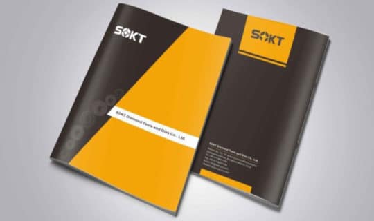
The application principle of color is: "overall coordination, local contrast". That is: the overall color effect should be harmonious, only some small areas can have some strong color contrast. In the use of color, different main colors can be used according to the needs of the content, such aswarm tones, that is, the combination of red, orange, yellow, ochre and other colors. The use of this tone can make the picture present a warm, warm and warm atmosphere.Cool colors, that is, the combination of cyan, green, blue and other colors. The use of this color tone presents a calm, cool and elegant atmosphere. Contrasting tones, that is, matching colors with completely opposite chromaticity in the same space. For example: red and green, yellow and purple, orange and blue, etc. The combination of this color can produce a strong visual effect, giving people a bright, bright and festive feeling. Of course, contrasting shades, if used poorly, can backfire and have a cheesy, garish effect. This is to grasp the important principle of "major harmony, small contrast", that is, the overall tone should be a unified and harmonious part where there can be some small strong contrasts.
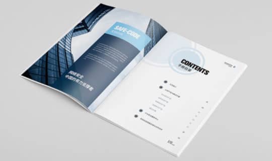
Finally, considerAlbum background color (background color) dark and light, borrowing a term from photography here, that is, "high-key" and "low-key" with a light background is called high-key; dark background is called low-key. With a dark background, the color of the text should be light, and a dark background should be used to contrast the light. On the contrary, the color of the text with a light background should be darker, and the dark content (text or picture) is contrasted with a light-colored background. This change in depth is called "lightness" in color science. "Change" on some homepages, the background color is black, but the text also uses a darker color, and the brightness of the color is relatively close. When the reader is reading, the eyes will feel very tired, which affects the reading effect. Of course, the brightness of the color also Don't change too much, otherwise the brightness contrast on the screen will be too strong, which will also make the reader's eyes unbearable.
Fourth, leave blank
The same is true for dealing with images in album design. Appropriately left blank, in fact, injected vitality into the album. Boldly leave large pieces and blanks, because appropriate and reasonable blanks can convey the designer's elegant aesthetic taste, break the rigid and dull routines, make the album transparent, cheerful, jumping and fresh, giving readers a visual effect Causes brisk and pleasant stimulation, and the eyesight is relaxed and rested. Of course, large blanks should not be used indiscriminately. Once blank, there must be echoes and transitions, so as to avoid form for the sake of form, resulting in an empty layout. White space cannot be simply understood as blank space. White space does not mean that there is nothing to say, just blank space, but to set off the main part of the photo with less content or a single color. In addition, the style required to create a set of pictures is generally realized in the blank area, so some other necessary elements, such as text, should be added to this blank area.
5. Graphic and text collocation
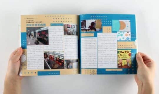
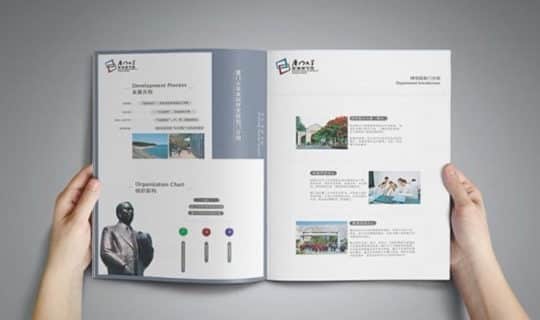
The picture and text list arrangement is suitable for information sorting and summarization, product introduction, and more text. If there are more pictures, you can use 4-corner arrangement, 3-corner arrangement, and side-by-side arrangement. If you want the pictures to be displayed in a larger size, you can use the unilateral arrangement. The text is generally arranged next to and below the picture, and the height or width of the picture is the same. Images with text nearby are smaller, and images without text nearby are larger. And the picture with less text is larger, and the picture with more text is smaller. Picture text list: This method is used when there is a lot of picture information. There are no pictures with a large area in the layout, and the pictures are small. Each picture is matched with a text paragraph aligned with it, and is arranged in the same width or height. In the graphic list form, the text information is arranged below the picture or left and right. The text is the same width when it is below, and the same height when it is on the left and right.
